Projecting Much?
A whole lot of projecting. How we figured out the shape of the Earth, who gets to sit at the center of the map, and a tool that lets you move them there - with 28 live projections and 1.3 million real survey marks.
A whole lot of projecting.
Ask someone to picture the world map and they will picture a specific one: Mercator's, drawn in 1569 to keep compass bearings straight for sailors. That image is not a neutral fact. It is navigation math from the 16th century, ratified by naval politics in the 19th, repeated until it became furniture. And it has company - every mapmaking culture, from Babylon to the phone in your pocket, has drawn itself at the center and called the result objective.
This page is about how we worked out the shape of the Earth, and how we keep re-working it. It carries a tool that recenters the world on any point you click, using the real projection math; 28 named projections rendered live; and the physical network of survey marks that pins the abstraction to actual sidewalks.
First, Everyone Was the Center
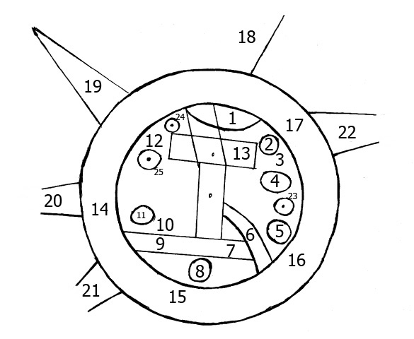
The oldest surviving world map is a clay tablet from Babylon, drawn around the 7th century BCE. It shows the world as a flat disk ringed by a "bitter river" - with Babylon sitting at the center, roughly the size of a continent. Early Greek cosmology drew a similar disk; classical Chinese astronomy held a "round sky over a square earth" (the Gaitian model of the Zhoubi Suanjing) for centuries, even as the rival Huntian school held that the heavens were a sphere enclosing the Earth. Zhang Heng, who built a water-driven armillary sphere around 125 CE, was its most famous exponent. A disk is what the horizon looks like, and the center is where you are standing.
The Greeks talked themselves out of it. Pythagoras and Parmenides proposed a sphere on philosophical grounds, but Aristotle assembled the physical case: the Earth's shadow on the moon during an eclipse is always round, ships disappear hull-first over the horizon, and the stars shift as you travel north or south. Around 240 BCE, Eratosthenes turned the sphere into a number. Told that the summer-solstice sun shone straight down a well in Syene while casting a 7.2-degree shadow in Alexandria, he multiplied the angle out across the known distance between the two cities and got 252,000 stades. How close that is depends on which stade he meant, and nobody knows: at the Attic stade it works out to about 46,600 kilometers, sixteen percent too large, and at the Egyptian one to about 39,700, under a percent off. The famous accuracy is a choice among reconstructions.
Twelve centuries later al-Biruni worked out a subtler method: climb one mountain of known height, measure the dip of the horizon, and solve for the radius of the Earth from a single vantage point. He derived a radius of about 6,339 kilometers. Historians debate whether his instruments could really deliver the precision he reported, which is the same question that hangs over Eratosthenes' stade. By his time the shape of the Earth was an engineering problem rather than a cosmological one.
Measuring a degree of latitude directly - walk north until the pole star climbs one degree, and record how far you walked - was not a European idea. Astronomers working for the caliph al-Ma'mun did it on the Sinjar plain around 830, sending two parties out from a common base in opposite directions. A century before that, in 724, the Tang astronomer Yi Xing and the official Nangong Yue ran gnomon measurements at stations stretching from what is now Vietnam toward Mongolia, and used them to disprove the shadow rule written in their own canonical text.
Then the Sphere Fell Apart
Newton predicted that a spinning Earth should bulge at the equator and flatten at the poles. The Cassini family - France's dynasty of royal astronomers - measured the opposite: an Earth stretched long like an egg. The argument mattered for every chart in every navy, so in the 1730s France did the expensive thing and sent two expeditions to measure a degree of latitude at the extremes: Maupertuis to Lapland, La Condamine to Peru. A polar degree came back longer than an equatorial one. Newton was right; the Earth is an , its equatorial radius about 21 kilometers longer than its polar one.
In 1792, revolutionary France sent two astronomers - Delambre working north, Méchain south - to survey the meridian from Dunkirk to Barcelona, so the new republic could define the meter as one ten-millionth of the distance from pole to equator. It took seven years, through a country at war, with Méchain privately tormented by latitude measurements at Barcelona that refused to reconcile. The commission fixed the meter anyway, and it came out about a fifth of a millimeter short - not because the surveyors failed, but because the Earth's flattening is not uniform, and they had extrapolated a whole planet from one slice of it. The meter has since been redefined by krypton lamps and then by the speed of light, but its length still carries that wrong guess about the shape of the Earth. It is in every ruler you own.
The triangulated web this page draws further down has a real ancestor. Between 1816 and 1855, Friedrich Georg Wilhelm von Struve chained triangulations from Hammerfest on Norway's Arctic coast to the Black Sea - 2,820 kilometers and 258 main triangles, run on the authority of two empires across land they held by conquest, now split among ten countries - to measure the curvature of one long slice of the planet. Thirty-four of its station marks survive, and together they are now the Struve Geodetic Arc, a UNESCO World Heritage site: the only monument on the list that is, essentially, a set of survey benchmarks.
India's Great Trigonometrical Survey ran the same idea at imperial scale, and imperial scale meant imperial purpose: the survey was the East India Company's instrument for taxing, titling, and holding the land it triangulated, carried across six decades on the labor of thousands of Indian porters, flagmen, and human computers. Among them was Radhanath Sikdar, the Bengali mathematician who computed that Peak XV was the highest point on Earth - a peak that already had names: Chomolungma in Tibetan, Sagarmatha in Nepali. The survey also tripped over the geoid before anyone had a word for it. Near the Himalaya, surveyors' plumb lines swung measurably toward the mountains, pulled sideways by all that rock, so positions fixed by the stars and positions carried up by triangle refused to agree. That discrepancy - a few seconds of arc - launched the theory of , and it was the first hard evidence that gravity's "down" wobbles from place to place. Every root tip in that foreland had been growing along the same deflected vertical for as long as there had been roots, sensing it with starch grains that settle like a plumb bob. So does the otolith organ in your own inner ear. We were never short of the sense; what took two thousand years was agreeing about down, in a number a stranger could check. No root has ever published.
The satellite era broke the shape again. Gravity-mapping missions - GRACE and its successor GRACE-FO, Europe's GOCE - revealed that the surface that actually defines "sea level" is neither sphere nor spheroid but the geoid: the lumpy, potato-shaped surface where Earth's gravity potential is equal everywhere. It dips about a hundred meters below the reference ellipsoid south of India and swells above it over the North Atlantic. There is no formula for it. It has to be measured, point by point, and re-measured as ice sheets melt and aquifers drain, because the geoid moves.
Your GPS receiver computes position against WGS84 - the smooth mathematical ellipsoid - because satellites orbit math, not potatoes. True elevation is measured against the geoid, because water flows downhill along gravity, not geometry. The gap between the two is the geoid separation, and if your phone or hiking app skips the correction (EGM96 or EGM2008, in practice), your "elevation" can be off by tens of meters. A surveyor signing an elevation certificate is working that same problem with a mortgage attached: the instrument reports against a model of the Earth, and the model is a choice.
For more than a century, the National Geodetic Survey and its predecessors have been bolting small bronze disks into bedrock, bridge abutments, courthouse steps, and mountain summits. Each one is a point whose position - and, for the vertical network, whose precisely leveled elevation - is known and published. These marks are the datum: the physical anchors against which American elevation is defined, the place where the abstract geoid math touches an actual sidewalk. Many of them double as benchmark-hunting targets for geocachers. They were also laid across land taken from the people already living on it: the geodetic network and the survey that subdivided and sold the public domain were the same instrument.
The United States is not alone, but it is not typical either. New South Wales publishes 202,012 survey marks; OpenStreetMap volunteers have recorded 292,960 survey points worldwide - Britain's trig pillars, Japan's triangulation stations. What lights up here is not where marks exist; it is where they are published. Coverage follows open data, not geography, and a dark country on this globe may guard the very same disks.
And the disks themselves are becoming history. NOAA is in the middle of replacing the leveled datums - the ones the bronze marks physically carry - with a modernized system defined by GNSS and a gravity model, because satellites don't rust, subside, or get paved over. When it lands, official elevation in the United States will come from orbit and physics rather than a century of hand-leveled lines between disks. The marks will stay in the sidewalks. They are turning from infrastructure into monuments.
The Geoid Is a Bronze Disk in a Sidewalk
A gravity model is a stack of waves wrapped around the globe, ordered from longest to shortest. This slider sets how many of them get added back - the model's . Degree 2 is the single longest wave. Degree 180 is all of them at once, which is the lumpy surface the rest of this page calls the geoid.
One mile above sea level, four times
In 1909 Colorado put a bronze marker on the fifteenth step of its state capitol reading ONE MILE ABOVE SEA LEVEL. People kept stealing it, so in 1947 the state carved the words into the stone instead. In 1969 engineering students from Colorado State University resurveyed the staircase, made the mile the eighteenth step, and set a brass marker there. A 2003 survey moved it down to the thirteenth. On 10 July 2026 surveyors from NOAA's National Geodetic Survey settled on the seventeenth, and marked it with a stroke of Sharpie: a temporary marker goes down for Colorado's 150th birthday, and the permanent disk waits on the new datum being finished.
What keeps changing is the meaning of "above sea level." Since 2007 NOAA has been flying GRAV-D, an airborne gravity survey that finished its last territory in 2023, and combining it with satellite and surface measurements to rebuild the geoid - the same lumpy surface the globe above draws in Geoid mode. Sea level is wherever gravity says it is, so a better map of gravity is a new zero.
Every published height in the country moves with it, and NAVD 88 - the datum every flood map, elevation certificate and drainage plan in the United States is written against - is replaced by a gravity-based one. Colorado's fourteeners are being relisted off the same measurements, though no peak drops below 14,000 feet.
Two of the capitol's own bench marks are in the globe above, on other sides of the building rather than these steps, and they bracket the answer. KK0359 sits about four and a half inches below a mile; KK0360 sits about seven inches above it. Both were monumented in 1897, and both carry NAVD 88 heights that will move again when the datum does.


Take B 339, a first-order mark the Coast and Geodetic Survey set into a tunnel wall in Central Park in 1952. Elevation is measured up from sea level, and sea level really means the . GPS measures up from the instead. In Central Park the GEOID18 model puts those two surfaces 31.658 meters apart, so the same bronze disk stands 32.403 meters above one and about 0.7 meters above the other. Your phone hides this: it applies a geoid model of its own before showing you a number. Take that correction away and a satellite fix would place you at roughly sea level while you stand 106 feet above it.
I know that disk because of a 2021 GIS course at GSAPP with Leah Meisterlin, who sent the class out to find a benchmark and confirm it was still where its datasheet said.
Meanwhile, the Flat Map Got Political
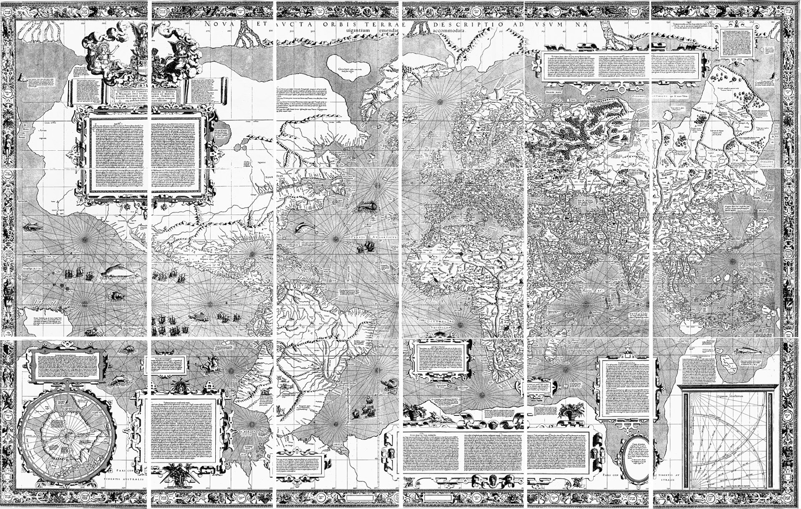
Knowing the Earth's shape and drawing it flat are different problems - flattening a sphere always costs something, and the choice of what to sacrifice is the projection. Mercator's 1569 chart made a specific, brilliant trade: it distorts area so that draw as straight lines. For a sailor that is everything. The price grows toward the poles: on a Mercator, Greenland reads about the size of Africa. Africa is roughly fourteen times larger. Europe's naval powers adopted the chart, empires shipped it everywhere, and four centuries of repetition installed a navigation tool as the world's mental image of itself.
The center got voted on, too. In 1884, delegates from 25 nations met in Washington to pick a prime meridian, and Greenwich won 22 to 1 - San Domingo voting against, France and Brazil abstaining. An 1879 survey had already found 72% of the world's shipping tonnage navigating on Greenwich-based charts, a legacy of British naval dominance. The vote ratified the market. France, unpersuaded, avoided the word "Greenwich" in official documents for decades, preferring "Paris mean time, retarded by 9 minutes 21 seconds."
A century later the map's politics went mainstream. Arno Peters unveiled an equal-area world map in 1973 as a corrective to Mercator's inflated North - without much crediting James Gall, who published the same projection in 1855. Aid organizations and UNESCO-adjacent groups adopted it; it eventually got a whole scene on The West Wing. Watch the map stretch as you scroll: every country lands at its true relative size, and the tropics Peters claimed to champion pay for it in shape.
Cartographers pushed back hard - Peters' rhetoric oversold his map's neutrality, and by 1989 seven North American cartographic societies had passed a joint resolution urging that no rectangular projection be used for general world maps. The shape this map is settling into is their answer: a compromise with curved edges.
Every map is a choice. This one is drifting back to the Mercator - but south up and centered on Australia, McArthur's 1979 joke with real math in it - because the next map on this page is yours: the same Mercator, with the center handed to you.
Recenter the World
The Gallery: 28 Ways to Flatten a Planet
Each projection preserves something and pays for it with something else: bearings (Mercator, Craig), area (Gall–Peters, Mollweide), continuity of the oceans (Spilhaus's heirs).
The fun ones
None of these were made to get a ship anywhere. They were made to find Mecca, to win an argument with a teacher, to fill a philosopher’s day job, and in one case for no reason at all - the heart just fell out of the math.
The canon
The deep cuts
Go Deeper
- John P. Snyder, Map Projections: A Working Manual (USGS, 1987) - the field's bible, free as a PDF. Every projection in the gallery is in here, with the math and the history.
- John P. Snyder, Flattening the Earth - the same author's history of two thousand years of projections, for reading rather than computing.
- Ken Alder, The Measure of All Things - the Delambre and Méchain expedition as a full-length story, including the concealed error.
- J.B. Harley, "Deconstructing the Map" - the 1989 essay that taught cartography to read itself as rhetoric. The thesis of this page, argued first and better.
- Denis Wood, The Power of Maps - every map serves an interest, including the ones that claim not to.
- Mark Monmonier, How to Lie with Maps - the friendly field guide to cartographic persuasion, distortion chapter by distortion chapter.
- Laura Kurgan, Close Up at a Distance - satellite imagery, GPS, and the politics of the view from above; the bridge from this page's history to its present.
- NOAA: What is the geoid? - the two-minute official answer, and a good sanity check on this page.
- NOAA's datum modernization - the program retiring the leveled datums the bronze disks carry.
- ICGEM - the public archive of Earth gravity models. The EGM96 coefficients behind Geoid mode came from here.
- The International Meridian Conference, 1884 - the meeting that put Greenwich at zero, votes and dissents included.
- Jason Davies: projection transitions - watch one projection morph into another - the inspiration for the morphing story above.
- xkcd 977: Map Projections - what your favorite projection says about you.
- d3-geo-projection - the library carrying most of the gallery, and the place to go if this page makes you want to build one.